

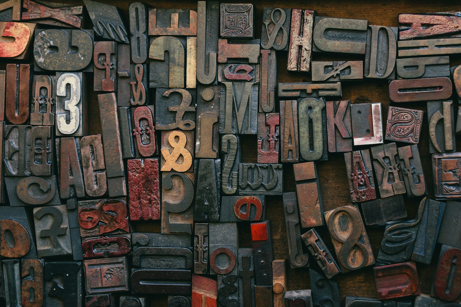
Design
The case for the serif on the web
The ghost constraint.
Serifs were a technical mistake on early screens, not a design law. The hairline strokes that define them, the tiny feet, the contrast between thick and thin, were too fine for a pixel grid in 2008. The screen guessed at them and the guess looked like mud.
So the industry agreed: serifs for print, sans for screens. That wasn't a design philosophy. It was damage control.
The constraint is gone, and we kept obeying its ghost. Modern displays pack two to four times the pixels into the same inch. Apple was confident enough that in 2018 it turned off subpixel antialiasing across macOS, the old rescue trick for thin strokes, because the displays no longer needed it.
When every startup landing page looks like the same Helvetica clone, a serif headline says a person made this on purpose.

Pick for meaning.
The reason serifs failed on screen is over, which means the choice is free to be about meaning. What actually moves legibility is size, x-height, line length, contrast. Serif versus sans barely registers. So you pick type for what it says, not to win an argument.
A serif reads as considered. It carries the memory of every book and newspaper that came before the web, and that memory does work whether the reader notices it or not.
The strongest case is editorial: long-form reading, an essay, an about page where a company is trying to sound like it has a soul. Down there the serif carries the register the sans cannot. Small UI text, buttons, form labels, dense data tables — that is where a workhorse sans wins, where the reader scans instead of lingers.
A serif with real character usually wants more font weight to load. The answer is not retreating to a system sans. Subset the font to the characters you use, self-host it, preload the weight above the fold. Done right, a serif costs almost nothing.
Safe and forgettable are the same address.
The sans-everything era lasted so long because it was safe. But safe is how three landing pages blur into one. Pick the serif when the page is meant to be read, build it so it loads clean, and let it say the thing your headline can't say on its own.
The sophisticated move is not picking a side. It is pairing: serif where the reader lingers, sans where the reader scans. That pairing is written into the studio's own type specimen, and it runs through every site we build.