

Design
Warm, not soft
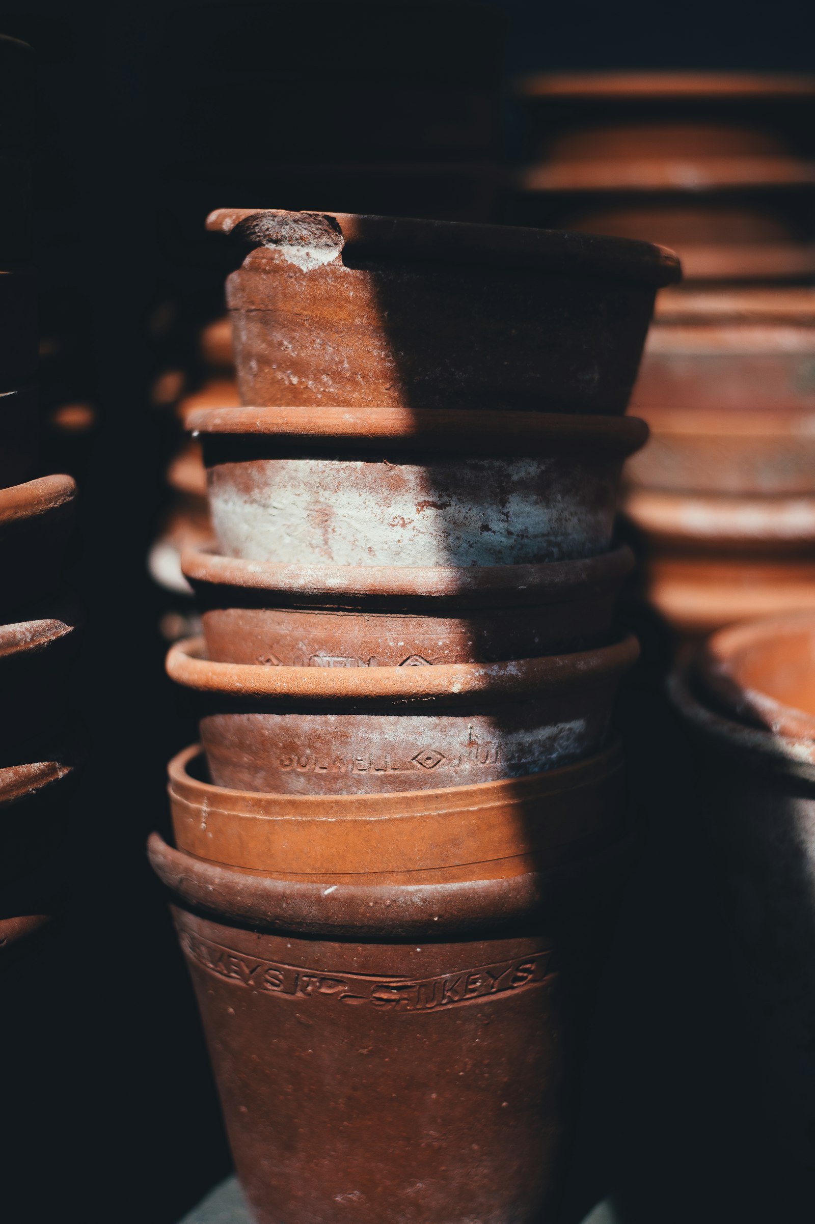
Clay accent. People brace for pastel.
A warmish terracotta, and the first thing people assume is that the site will be all rounded corners and pastel reassurance. It isn't. The whole point of the choice is that warm and soft are two different things, and most of the web has quietly agreed to confuse them.
The blue-grey that almost every serious site reaches for isn't a design decision anymore. Somewhere between a cool slate and a corporate sky, paired with grey, a thin sans-serif, generous whitespace. Something like half of the top tech brands use blue. Nobody gets fired for blue.
When every site signals trust the same way, the signal stops doing any work. You scroll three SaaS homepages and they blur into one long cool-grey hallway. Sameness reads as nothing, not as safety.
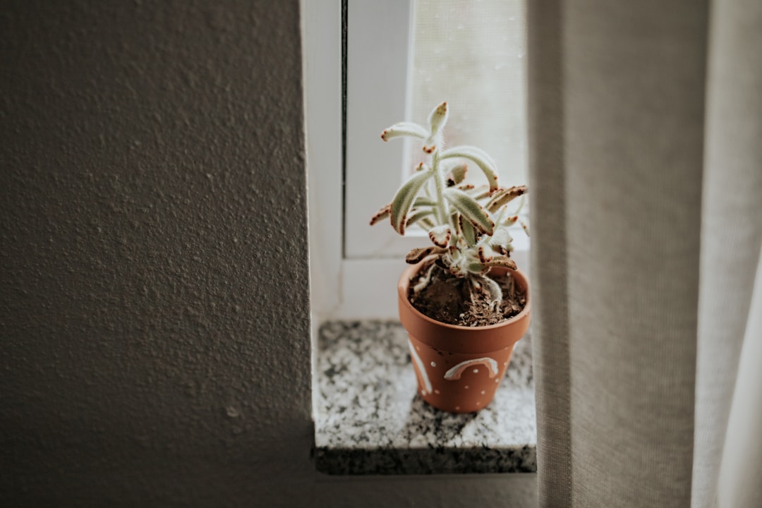
Soft is a failure of nerve wearing a warm color.
Warm palettes get a bad reputation because the people who reach for them let everything else go soft at the same time. Contrast drops. Type gets timid. Everything rounds off and the hierarchy melts. That's not the color's fault. That's a failure of nerve that happened to be wearing a warm color when it failed. The same discipline is what keeps restraint from reading as emptiness elsewhere on a page.
A clay accent at full saturation on white usually doesn't clear the 4.5-to-1 contrast ratio normal text needs. So we don't put body copy in it. Everything load-bearing stays near-black on off-white. The warm note pops precisely because it's rationed.
The accent marks the one thing on screen that matters most right now, the button, the link, and then gets out of the way. One color, one job. We earn the right to use it by being ruthless about where it goes.
Warm reads as human. Soft rots the structure.
The contrast pairings are built into the system as design tokens, so the accessible combinations are the only easy ones to use. If a button ships, it ships with text that passes. Soft is when the feeling leaks into the structure and rots it. Warm is when the structure holds and the feeling sits on top.
Warm is when the structure holds and the feeling sits on top. That's the same principle behind what we believe about every design decision we make: the feeling never gets to override the structure underneath it.